Arthur Taylor
Welcome to my Graphic Design portfolio, this site contains all of my best work from my time as a student at Iowa State University so far.Contact me:
[email protected]
Find me online:
Posters
A collection of posters I designed.SPEAK UP! was displayed during the "Perceptions III – Human" poster exhibition in Poland

Defining Two Spirit

A Brief Explanation of Two Spirit History

Results of Trauma and Fighting Back


This poster series was designed for a class on Native American religious studies. As a person that is part of the LGBTQIA+ community I wanted to learn more about Two Spirited people and their history so I did a lot of research on the topic and tried my best to condense what I learned into these three posters. My goal is to try and inform those who take the time to read them about Two Spirit people and hopefully encourage them to seek out more information on the topic.

SPEAK UP!

SPEAK UP! at the "Perceptions III - Human" exhibition

ASK!


"SPEAK UP!" was made to represent that homophobia and abuse can cause some people to feel as if they can't open about what they're going through so its important to help others when they don't feel like they can."ASK!" was designed to open peoples minds to the fact that pronouns don't always match someone's gender or the way they choose to present themselves so its important to ask them how they would like to be referred to.
Logos
A collection of logos I designed for a variety of different projects including commission and personal work.
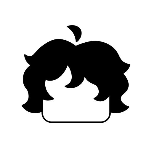
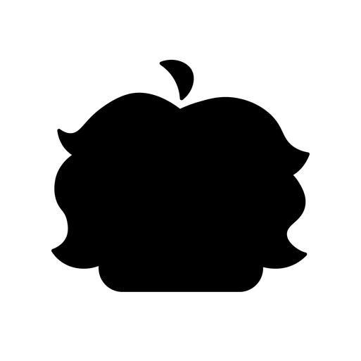
Primary logo for the Arthur Draws Stuff brand
Primary logo (Filled) for the Arthur Draws Stuff brand

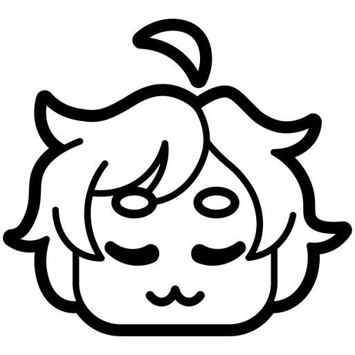
Secondary logo (Happy) for the Arthur Draws Stuff brand
Secondary logo (Content) for the Arthur Draws Stuff brand
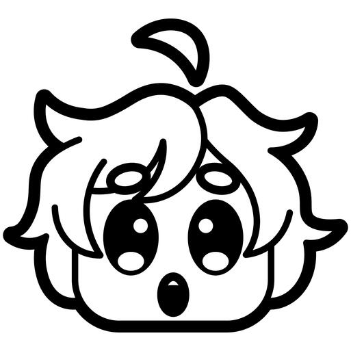
Secondary logo (Shocked) for the Arthur Draws Stuff brand
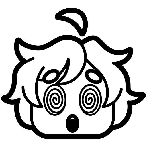
Secondary logo (Confused) for the Arthur Draws Stuff brand
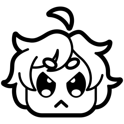
Secondary logo (Angry) for the Arthur Draws Stuff brand
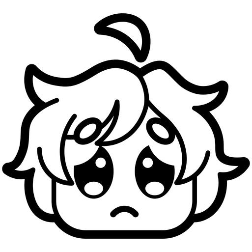
Secondary logo (Sad) for the Arthur Draws Stuff brand

Tileable Pattern


Arthur Draws Stuff is my personal brand identity, these logos and logo variants were designed to help bring a more cohesive look and feel to my social media presence.

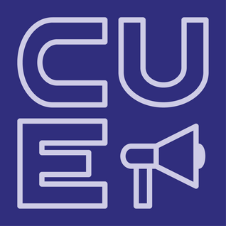
Cue Logo (horizontal)
Legislation

Media
Protesting
Students


CUE (Coalition for Equitable Universities) is a pro DEI coalition that I am a part of at Iowa State University. I have designed many fliers for them as well as a set of logos with multiple color variations and Icons for different parts of the coalition to use as needed. The ones shown are just a few examples of the designs as each one has a full range of color and orientation variants.

KASJ Design

Meadow Boutique St. Francis

Sun-kissed Cantina

Rosa Sin Espinas


Above are a handful of logos and logo variants I designed for a class project where we were designing a boutique hotel. my group decided to brand ourselves using the first letters of our names and named our hotel Meadow Boutique St. Francis, inspired by the location being a school not too far from St. Francis Cathedral in Santa Fe.The other two logos were designed for the Restaurant and Spa that would be made available for hypothetical guests.

Sensory Ride abstract mark

Sensory Ride abstract mark animated
Sensory Ride app icon
![Sensory Ride combination mark]()
Sensory Ride combination mark

Sensory Ride combination mark animated


These logos were designed for the concept of an off shoot of the CyRide brand at Iowa state. The Sensory Ride brand was designed for those with sensory issues to have an easier time getting around campus.

GLAAD logotype

GLAAD logotype animated
GLAAD logomark

GLAAD logomark animated


The GLAAD logos were made for a rebrand project where I chose GLAAD, an organization that represents the LGBTQIA+ community and highlights news and media related to queer identities.
Typography
Typefaces I designed.
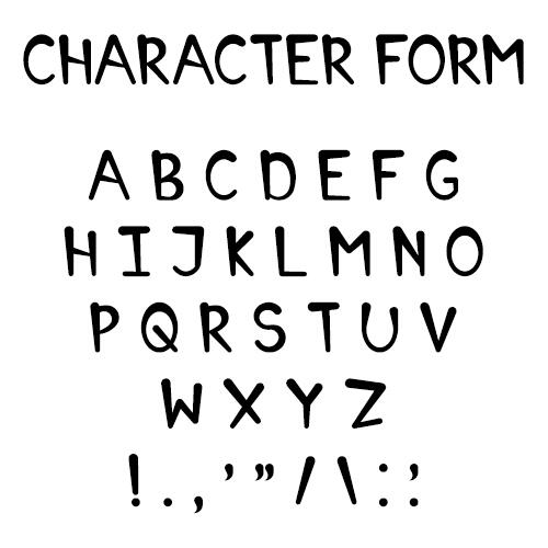
Character Form font

I designed this font for use in Character Form Zine.
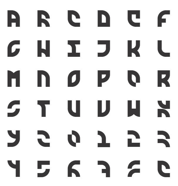
Modern Celtic

Pangram

Modern Celtic Halftone

Pangram


Modern Celtic is a constructed typeface I designed for my final typography class at Iowa State University. It's design is made using only two shapes, a square and quarter circle curve, and is fit into a 4x3 design space.
Other Projects
A collection of other projects that contain multiple elements of Graphic Design.

Arthur Draws Stuff Channel Banner

Above is the banner I designed for my YouTube channel, Arthur Draws Stuff.

Character Form cover

Character Form is a zine that I created for a class project that would go over different franchises and the character design choices made in order to teach the reader about the basics of character design. It uses the Character Form font I designed for it throughout the zine.